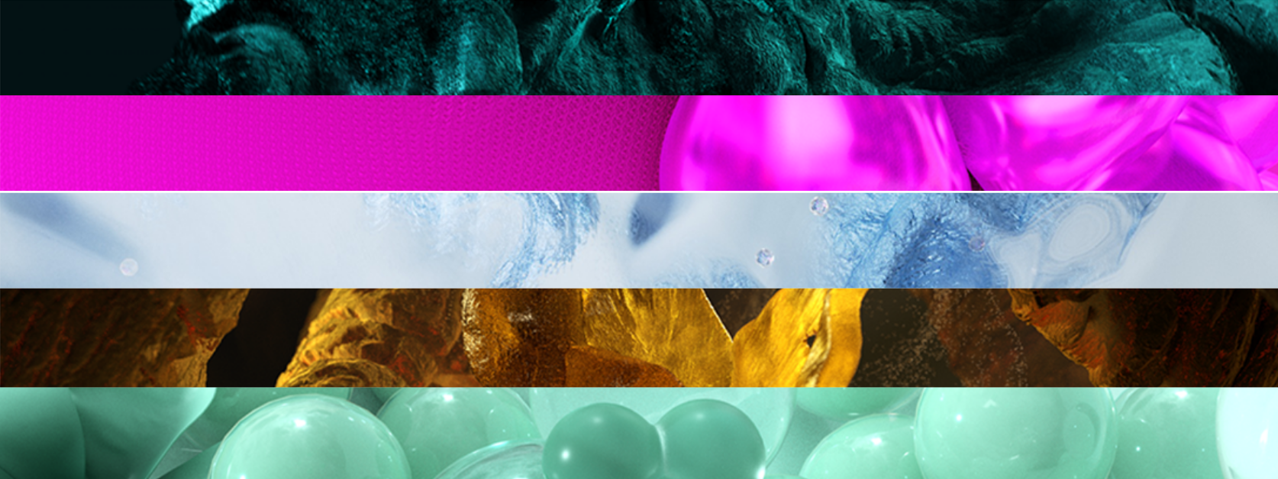
2026 marks a turning point of redirection—a time when old ideas are questioned and new directions emerge.
WGSN (Worth Global Style Network) is the world’s leading consumer and lifestyle trend authority, forecasting how people will think, live, and buy in the years ahead. In collaboration with Coloro—a human-centered colour system—they translate these shifts into colour directions that define S/S 2026 and beyond.
For performance apparel and urban lifestyle brands, colour is no longer decoration—it’s the intersection of technology, sustainability, and emotion. It echoes Hwafune’s core value: human-centered development of premium functional fabrics.
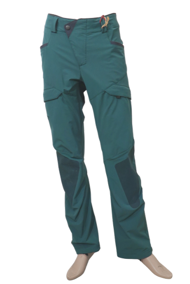
Transformative Teal ┃ Coloro 092-37-14 ┃ Pantone 19-4517TCX
Symbolising Resilience and Regeneration ┃ NO. B-1300-3-A37
A fluid fusion of blue and green—calm yet restorative. It represents a renewed relationship with nature—one of collaboration, not imitation. Transformative Teal reflects humanity’s regenerative strength and adaptability amid climate challenges, symbolising a new harmony between nature and technology.
|
 |
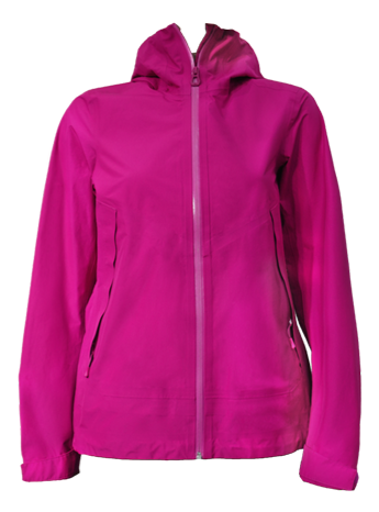
Electric Fuchsia ┃ Coloro 144-57-51 ┃ Pantone 17-2624TCX
The Energy of Disruption ┃ NO. W-4966-T43H
A vivid neon between pink and purple—charged, kinetic, and daring. It embodies the creative unrest of our era and the blurred boundaries between real and virtual worlds. In an age shaped by AI and digital design, Electric Fuchsia reminds us that innovation begins where balance is broken.
|
 |
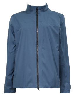
Blue Aura ┃ Coloro 117-77-06 ┃ Pantone 14-4112TCX
The Harmony of Softness and Craft ┃ NO.W-4158-T30K-02
A greyed pastel blue—gentle yet futuristic. It captures the balance between engineered performance and natural tactility, inspiring new approaches to fabric development. Blue Aura conveys a new kind of warmth—where performance apparel integrates precision, softness, and emotional design.
|
 |
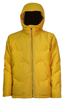
Amber Haze ┃ Coloro 043-65-31 ┃ Pantone 16-0838TCX
The Spiritual Warmth of Time ┃ NO. B-5014-L46
A warm yellow infused with green tones—soft, radiant, and subtly mystical. It evokes the beauty of ancient pigments and minerals, embracing the “slow energy” mindset in sustainable creation. Amber Haze conveys a mature, organic warmth—a reminder that true sustainability is a dialogue with time.
|
 |
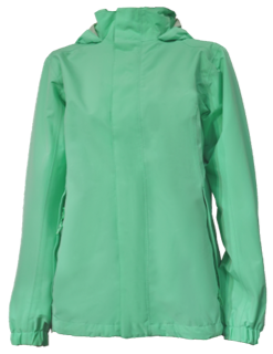
Jelly Mint ┃ Coloro 078-80-22 ┃ Pantone 13-5714TCX
The Playful Rebellion of Soft Power ┃ NO. W-2801-L48-1
A bright, translucent mint green—soft yet empowering. It represents a new design direction: shifting from rigidity to playfulness, from seriousness to healing. In anxious times, Jelly Mint celebrates the power of small joys, bringing lightness and inclusivity to design.
|

|
Trend Summary
The colours of 2026 go beyond aesthetics—they form a manifesto of rebalancing. They remind us that true innovation begins with understanding people, respecting nature, and transforming ideas into tangible fabrics.
For Hwafune, this evolution in colour represents a broader evolution in fabric innovation—where sustainability, technology, and aesthetics coexist within every fabric, becoming the shared language of future design.
We Create Connection Despite the Weather.
